class: center, middle, inverse, title-slide # MLCA Week 10: ## k-Nearest Neighbors ### Mike Mahoney ### 2021-11-03 --- .bg-washed-green.b--dark-green.ba.bw2.br3.shadow-5.ph4.mt5[ The introduction of numbers as coordinates is an act of violence. .tr[ — Hermann Weyl: Philosophy of Mathematics and Natural Science ] ] --- class: middle center # k-Nearest Neighbors # and Kernel-Based ML --- Today we're going to switch gears and stop talking about tree-based models. Our last two methods are examples of what are known as **kernel-based models** (or **kernel machines**). However, I don't necessarily want to spend a ton of time today getting into the math behind what a "kernel" is. Instead, for this class we can think about these models as being **distance-based methods**, which make predictions based on how _close_ an observation is to other data in the training set. --- The method we'll walk through first is called **k-nearest neighbors** (KNN), which bases its predictions based on some number ("k") of the closest points to your unknown observation. KNN is almost never the best model for the job. First proposed in 1951, KNN is incredibly computationally inefficient, is very slow to predict on most data, and rarely if ever is as accurate as a well-tuned random forest or GBM. However, KNN models are simple to understand and use, are somewhat common in the literature given their age, and will help to set up our final model next week. As a result, it makes sense for us to walk through them here. --- Let's say that you've just gotten back from the field, where you measured the size and greenness of a bunch of plants in both interior and edge forests. You plot your data and it looks like this: <!-- --> --- Unfortunately, though, you forgot to label where one of your plants was sampled from. When you add this plant to the plot, it looks like this: <!-- --> Can you guess where the plant was found? --- We can easily assume the plant was found on a forest edge, because it's right in the middle of the rest of our edge observations. This is exactly how k-nearest neighbors works. For some value of k that you choose, KNN looks at the closest k neighbors and predicts whatever the majority class is. For instance, if we set k = 1 our model would look at the closest point (attached on the graph by a black line) and predict that our unknown observation was an edge plant: <!-- --> --- We could also imagine, for instance, setting k to 2, in which case KNN would look at the two closest plots and still predict edge: <!-- --> --- A k of 2 can sometimes cause problems, however. For instance, imagine if this plant instead was our mystery point: <!-- --> --- If we set k to 2 here, we'd have one nearest neighbor from each class: 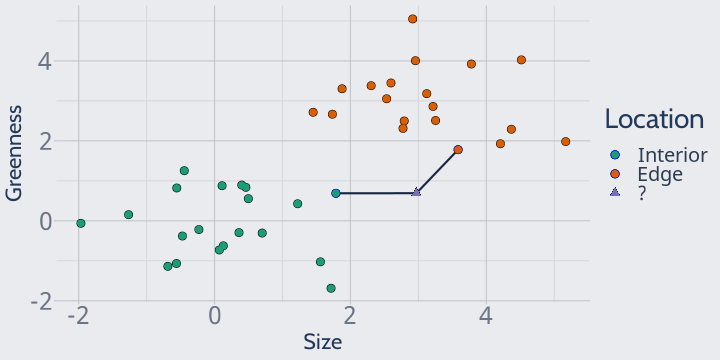<!-- --> In this case, our model would think that both classes are equally likely! What that means for your predictions depends on the package -- some implementations will fail entirely, some will flip a coin, and others will default to one of your classes -- but no matter what, it's not an ideal situation. --- So at least for binary classification, we prefer to always set k to odd values so that we don't wind up with ties in our predictions. For instance, with k = 3 we can easily categorize this plant as an edge plant: 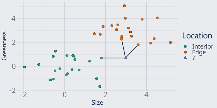<!-- --> --- I know this seems extremely simple, but I think it's useful to think about what exactly "distance" is representing here -- that is, how we're calculating "closeness". On our 2D graphs, we can see the "closest" point pretty intuitively. We put a variable on the X and Y axis, and then the closest point is the one that we can draw the shortest line between. It's the "nearest" in some combination of both the X and the Y values. And we could imagine doing the same thing in 3D: plotting each of our variables on an axis and then finding the shortest 1D line between two points. This is effectively what KNN is doing, except in many more dimensions -- as many dimensions as your data frame has columns. KNN is attempting to find the nearest neighbors based on all of your variables at once; it's trying to draw that 1D line in extremely high-dimensional space. But there's a problem with thinking of closeness in this way. To explain why, let's go ahead and load our attrition data into R and create our training/test splits: ```r library(modeldata) data(attrition) set.seed(123) row_idx <- sample(seq_len(nrow(attrition)), nrow(attrition)) training <- attrition[row_idx < nrow(attrition) * 0.8, ] testing <- attrition[row_idx >= nrow(attrition) * 0.8, ] ``` --- Our attrition data has many numeric variables. For instance, it has `Age` and `DailyRate`, both of which were useful predictors back in our decision tree models. Plotted together, they look like this: ```r library(ggplot2) training |> ggplot(aes(DailyRate, Age, color = Attrition)) + geom_point() + scale_color_brewer(palette = "Dark2") ``` 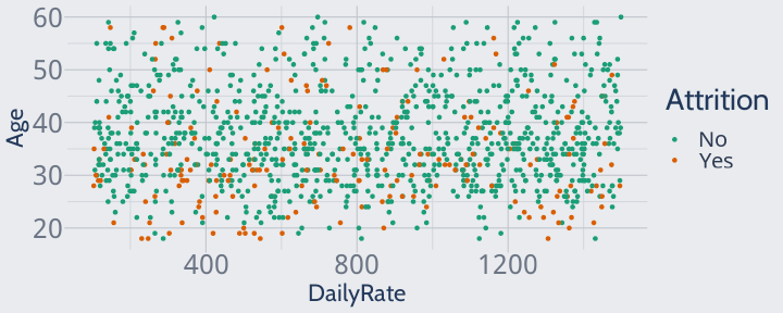<!-- --> --- However, this isn't how these variables look to a KNN. KNNs don't understand the implicit units in our data, or the fact that you can have a lot more variation in a daily rate than in age. To a KNN, a one-unit change in one variable is the same size as a one-unit change in another. To a KNN, our scatterplot looks like this: ```r training |> ggplot(aes(DailyRate, Age, color = Attrition)) + geom_point() + scale_color_brewer(palette = "Dark2") + scale_y_continuous(limits = c(0, max(training$DailyRate))) + scale_x_continuous(limits = c(min(training$Age), max(training$DailyRate))) ``` 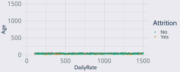<!-- --> --- Since all of our data is extremely close in age, the model won't pay any attention to age when finding neighbors or making predictions -- which isn't great, since we know age is an adequate predictor! ```r training |> ggplot(aes(DailyRate, Age, color = Attrition)) + geom_point() + scale_color_brewer(palette = "Dark2") + scale_y_continuous(limits = c(0, max(training$DailyRate))) + scale_x_continuous(limits = c(min(training$Age), max(training$DailyRate))) ``` <!-- --> --- To fix this, we'll have to **rescale** our data so that a one-unit change in one variable is _actually_ as dramatic as a one-unit change in another. First, we'll center our data at 0 by subtracting the mean value from each observation: ```r library(dplyr) training |> mutate(across(where(is.numeric), \(x) ((x - mean(x))))) |> ggplot(aes(DailyRate, Age, color = Attrition)) + geom_point() + scale_color_brewer(palette = "Dark2") ``` <!-- --> --- We'll then divide each observation by the original standard deviation of the vector. Our variables are now all rescaled so that one unit represents one standard deviation -- an Age value of 1 means that the employee was exactly one standard deviation above the mean age. This way, a change of 1 means the same thing across all of our variables. ```r training |> mutate(across(where(is.numeric), \(x) ((x - mean(x)) / sd(x)))) |> ggplot(aes(DailyRate, Age, color = Attrition)) + geom_point() + scale_color_brewer(palette = "Dark2") ``` <!-- --> --- So, because KNN uses all of our variables to calculate distance and doesn't understand units in our data, we need to center and scale our variables for the model to work properly. The other implication here I want to highlight is that KNNs use _all_ of our variables to calculate distance between points. Unlike tree-based methods, KNNs don't select only the most effective variables to use while making predictions. This means that, unlike tree-based methods, KNNs are susceptible to noisy variables, and might benefit from dimension reduction and feature engineering techniques (like PCA) which we don't cover in this course. This makes KNNs harder to use and often limits their accuracy compared to other methods. This is a consistent limitation of kernel-based methods; we'll return to this idea next week. --- So we need to center and scale our variables before fitting a KNN. However, we don't want to do this directly to our `attrition` data frame, before we split it into testing and training pieces! Remember that the testing data is supposed to be entirely unknown to the model and the modeler; including testing data in your calculations of mean and standard deviation violates that assumption. This type of mistake, where testing data influences your training data and your models themselves, is known as **data leakage** and can result in too-optimistic estimates of model accuracy, as your hold-out set is no longer truly being held out. As a result, we need to calculate the mean and standard deviation of each variable on our training data, and scale both the training and test sets by those values. While we don't have time to cover much data pre-processing in this course, I want to emphasize that this rule applies to anything you do to your data before fitting a model -- whether it's deciding to filter out variables, rescaling data, imputation, creating principal components, or anything else, you _need_ to make sure testing data never influences the data you train your models with. --- This is where the `recipes` package we mentioned last week really shines. You might remember that we can specify our pre-processing steps by creating a "recipe" object, using `step_` functions to declare what steps we want to perform, and then finishing up with `prep()`. Since we want to center and scale our data, we'll use the `step_center` and `step_scale` functions in our recipe: ```r library(recipes) scaling_recipe <- recipe(Attrition ~ ., data = training) |> step_center(where(is.numeric)) |> step_scale(where(is.numeric)) |> prep() ``` The beauty of `recipes` is that, because we've specified what data to use in the recipe in our `recipe()` call, our `scaling_recipe` will automatically use values from our training data to center and scale whatever data we want. All we have to do is pass our training and testing data to the `bake` function to rescale our data without any threat of leakage: ```r training <- bake(scaling_recipe, training) testing <- bake(scaling_recipe, testing) ``` --- And now we're finally able to get started fitting our first KNN! The best R package for fitting KNNs is actually one we've used before: `caret`. We'll load it now: ```r library(caret) ``` Fitting a KNN is then as simple as using `knn3` just like `lm` or most of the other model functions we've seen: ```r first_knn <- knn3(Attrition ~ ., training) ``` Once that finishes, we'll get a 5-nearest neighbors model object! ```r first_knn ``` ``` ## 5-nearest neighbor model ## Training set outcome distribution: ## ## No Yes ## 971 204 ``` As usual, we can investigate this model using a confusion matrix (on the next slide). --- ```r confusionMatrix( predict(first_knn, testing, type = "class"), testing$Attrition, positive = "Yes" ) ``` ``` ## Confusion Matrix and Statistics ## ## Reference ## Prediction No Yes ## No 258 30 ## Yes 4 3 ## ## Accuracy : 0.8847 ## 95% CI : (0.8427, 0.9188) ## No Information Rate : 0.8881 ## P-Value [Acc > NIR] : 0.6175 ## ## Kappa : 0.1154 ## ## Mcnemar's Test P-Value : 1.807e-05 ## ## Sensitivity : 0.09091 ## Specificity : 0.98473 ## Pos Pred Value : 0.42857 ## Neg Pred Value : 0.89583 ## Prevalence : 0.11186 ## Detection Rate : 0.01017 ## Detection Prevalence : 0.02373 ## Balanced Accuracy : 0.53782 ## ## 'Positive' Class : Yes ## ``` --- We can also use our old friend the ROC curve to calculate the AUC of this model: ```r library(pROC) auc( roc( testing$Attrition, predict(first_knn, testing)[, 2], plot = TRUE ) ) ``` <!-- --> ``` ## Area under the curve: 0.58 ``` It turns out, this model does a pretty bad job predicting our test set. --- Looking at our specificity rates, it might be helpful if we balance our classes before predicting. `knn3` doesn't take weights as an argument, so we'll need to resample our data in order to balance our training data: ```r training <- attrition[row_idx < nrow(attrition) * 0.8, ] testing <- attrition[row_idx >= nrow(attrition) * 0.8, ] positive_training <- training[training$Attrition == "Yes", ] negative_training <- training[training$Attrition == "No", ] n_pos <- nrow(positive_training) resampled_positives <- sample(1:n_pos, size = 5 * n_pos, replace = TRUE) resampled_positives <- positive_training[resampled_positives, ] training <- rbind( negative_training, resampled_positives ) ``` --- We also might get better results from choosing a different value of k. Like all other hyperparameters, we can tune this via a grid search. However, cross-entropy is a bad loss function for KNNs. KNNs don't _really_ predict probability, they just predict whatever class the majority of neighbors are. If we force KNN to report probabilities, what we get back instead are percentages of how many neighbors belong to each class. This means that a k of 1 can only predict 100% and 0% probabilities, a k of 3 0%, 33%, 67%, and 100%, and so on. Since cross-entropy specifically penalizes confident-but-wrong guesses, this means that cross-entropy will usually decrease as k increases and guesses become less confident. As a result, cross-entropy will often favor higher values of k whether or not it improves our actual predictions. So instead, we'll use our old friend AUC as a loss function to tune KNNs. --- When we predict with `knn3`, we get a matrix of the "probabilities" (really proportions) of each class: ```r predict(first_knn, testing) |> head(1) ``` ``` ## No Yes ## [1,] 0.7777778 0.2222222 ``` To just get our positive probability, we'll index into the data frame: ```r predict(first_knn, testing)[, 2] |> head(1) ``` ``` ## [1] 0.2222222 ``` And so our function to calculate the AUC looks like this: ```r calc_auc <- function(model, data) { roc(data$Attrition, predict(model, data)[, 2]) |> auc() |> suppressMessages() } ``` I've also added a `suppressMessages` function here because `roc` is a pretty chatty function, which can get annoying when running it 100 times. --- We can then repurpose our `k_fold_cv` function from last time to tune our KNN. We'll scale our data each iteration to avoid data leakage from the testing fold: ```r k_fold_cv <- function(data, k, n) { per_fold <- floor(nrow(data) / k) fold_order <- sample(seq_len(nrow(data)), size = per_fold * k) fold_rows <- split( fold_order, rep(1:k, each = per_fold) ) vapply( fold_rows, \(fold_idx) { fold_test <- data[fold_idx, ] fold_train <- data[-fold_idx, ] scaling_recipe <- recipe(Attrition ~ ., data = fold_train) |> step_center(where(is.numeric)) |> step_scale(where(is.numeric)) |> prep() fold_train <- bake(scaling_recipe, fold_train) fold_test <- bake(scaling_recipe, fold_test) fold_knn <- knn3(Attrition ~ ., fold_train, k = n) calc_auc(fold_knn, fold_test) }, numeric(1) ) |> mean() } ``` --- k can go as high as the total number of rows in your data (in which case you'll always predict the more common class) or as low as 1 (using only the closest neighbor), and there's really not a good rule of thumb for what k values to try. We'll go ahead and try 20 k values evenly spaced between 1 and 401: ```r tuning_grid <- expand.grid( n = floor(seq(1, 401, length.out = 20)), auc = NA ) tuning_grid$n ``` ``` ## [1] 1 22 43 64 85 106 127 148 169 190 211 232 253 274 295 316 337 358 379 ## [20] 401 ``` We still don't want k to be even, however, in order to avoid ties in our classifications. We'll add 1 to all our even k values in order to make sure we've always got a tiebreaker neighbor: ```r tuning_grid$n <- ifelse( tuning_grid$n %% 2 == 0, tuning_grid$n + 1, tuning_grid$n ) tuning_grid$n ``` ``` ## [1] 1 23 43 65 85 107 127 149 169 191 211 233 253 275 295 317 337 359 379 ## [20] 401 ``` --- And with all that done, the code to iterate over our grid is pretty simple: ```r for (i in seq_len(nrow(tuning_grid))) { tuning_grid$auc[i] <- k_fold_cv( attrition, 5, n = tuning_grid$n[i] ) } head(arrange(tuning_grid, -auc)) ``` ``` ## n auc ## 1 85 0.7572562 ## 2 107 0.7544213 ## 3 169 0.7537498 ## 4 127 0.7526416 ## 5 253 0.7514675 ## 6 65 0.7509871 ``` --- Plotting k makes it pretty obvious that the value of k which maximizes AUC is somewhere just under 100. ```r ggplot(tuning_grid, aes(n, auc)) + geom_line() + geom_point() + labs(x = "k") ``` <!-- --> If we wanted, we could run a second grid search to investigate that area more thoroughly; right now we'll just run with k = 85. --- We have to rescale our training and testing sets in order to evaluate our hold-out accuracy: ```r scaling_recipe <- recipe(Attrition ~ ., data = training) |> step_center(where(is.numeric)) |> step_scale(where(is.numeric)) |> prep() training <- bake(scaling_recipe, training) testing <- bake(scaling_recipe, testing) ``` And with that done, we can evaluate our accuracy using AUC: ```r final_knn <- knn3(Attrition ~ ., training, k = 85) calc_auc(final_knn, testing) ``` ``` ## Area under the curve: 0.7627 ``` As well as via a confusion matrix, on the next page. --- ```r confusionMatrix( predict(final_knn, testing, type = "class"), testing$Attrition, positive = "Yes" ) ``` ``` ## Confusion Matrix and Statistics ## ## Reference ## Prediction No Yes ## No 192 12 ## Yes 70 21 ## ## Accuracy : 0.722 ## 95% CI : (0.6672, 0.7724) ## No Information Rate : 0.8881 ## P-Value [Acc > NIR] : 1 ## ## Kappa : 0.2088 ## ## Mcnemar's Test P-Value : 3.082e-10 ## ## Sensitivity : 0.63636 ## Specificity : 0.73282 ## Pos Pred Value : 0.23077 ## Neg Pred Value : 0.94118 ## Prevalence : 0.11186 ## Detection Rate : 0.07119 ## Detection Prevalence : 0.30847 ## Balanced Accuracy : 0.68459 ## ## 'Positive' Class : Yes ## ``` --- Overall, this KNN makes pretty adequate predictions! Odds are, we could do better with a well-tuned random forest or GBM, but as far as easily-explainable models go the KNN did alright. And that's KNN for classification! But the technique can be applied to regression tasks as well. Rather than predict the most common value, KNNs built for regression tasks predict the _average_ value of the neighbors (sometimes weighted by distance, sometimes not, depending on the package you use). We'll walk through the process quickly, but the fundamental steps are the same as when using KNNs for classification. First, we'll load our data: ```r ames <- AmesHousing::make_ames() row_idx <- sample(seq_len(nrow(ames)), nrow(ames)) training <- ames[row_idx < nrow(ames) * 0.8, ] testing <- ames[row_idx >= nrow(ames) * 0.8, ] ``` And create our function to calculate RMSE: ```r calc_rmse <- function(model, data) { sqrt(mean((predict(model, data) - data$Sale_Price)^2)) } ``` --- And lastly, we'll repurpose our `k_fold_cv` function. We need to make a few changes: + Instead of `knn3`, we'll use `knnreg` for regression modeling; + We're going to add `-all_outcomes` to our recipe steps, to make sure we don't scale and center our sale price; + And we'll change the formula in `recipe` and `knnreg` to `Sale_Price ~ .` and our loss function to `calc_rmse` The code with these changes is on the next slide. --- ```r k_fold_cv <- k_fold_cv <- function(data, k, n) { per_fold <- floor(nrow(data) / k) fold_order <- sample(seq_len(nrow(data)), size = per_fold * k) fold_rows <- split( fold_order, rep(1:k, each = per_fold) ) vapply( fold_rows, \(fold_idx) { fold_test <- data[fold_idx, ] fold_train <- data[-fold_idx, ] scaling_recipe <- recipe(Sale_Price ~ ., data = fold_train) |> step_center(where(is.numeric), -all_outcomes()) |> step_scale(where(is.numeric), -all_outcomes()) |> prep() fold_train <- bake(scaling_recipe, fold_train) fold_test <- bake(scaling_recipe, fold_test) fold_knn <- knnreg(Sale_Price ~ ., fold_train, k = n) calc_rmse(fold_knn, fold_test) }, numeric(1) ) |> mean() } ``` --- Just as before, we can iterate through possible k values, find the best one, and plot the relationship between k and RMSE: ```r tuning_grid <- expand.grid( n = floor(seq(1, 401, length.out = 20)), rmse = NA ) for (i in seq_len(nrow(tuning_grid))) { tuning_grid$rmse[i] <- k_fold_cv( training, 5, n = tuning_grid$n[i] ) } head(arrange(tuning_grid, rmse)) ``` ``` ## n rmse ## 1 22 34544.91 ## 2 43 36479.43 ## 3 64 37546.28 ## 4 85 38904.05 ## 5 106 39746.35 ## 6 127 40429.31 ``` --- ```r ggplot(tuning_grid, aes(n, rmse)) + geom_line() + geom_point() + labs(x = "k") ``` <!-- --> It looks like the best k is somewhere under 40! We'll run with k = 22 for now. --- Just as before, we need to rescale our training and testing data before fitting a KNN to the full training data: ```r scaling_recipe <- recipe(Sale_Price ~ ., data = training) |> step_center(where(is.numeric), -all_outcomes()) |> step_scale(where(is.numeric), - all_outcomes()) |> prep() training <- bake(scaling_recipe, training) testing <- bake(scaling_recipe, testing) ``` And we can now go ahead and evaluate our RMSE: ```r final_knn <- knnreg(Sale_Price ~ ., training, k = 22) calc_rmse(final_knn, testing) ``` ``` ## [1] 29419.37 ``` We've done dramatically better with random forests and GBMs, but KNN at least beats linear regression. --- class: middle And that, in a nutshell, is the k-nearest neighbors algorithm. As I mentioned at the start of these slides, KNN is extremely computationally inefficient and tends to not create as accurate models as the random forests and GBMs we've talked about in the past. However, k-nearest neighbor models are still somewhat prevalent in the scientific literature, and are a useful way for us to shift from tree-based to kernel-based models. Next week, we'll wrap up with the most famous kernel-based method of them all, the support vector machine. --- class: middle # References --- Titles are links: + [HOML Chapter 8 (KNNs) and 3 (Feature Engineering)](https://bradleyboehmke.github.io/HOML/knn.html)