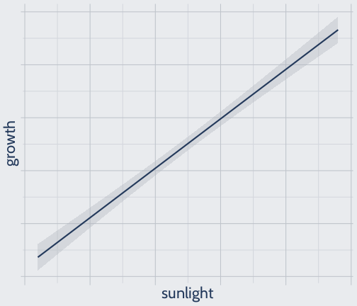
class: center, middle, inverse, title-slide # MLCA Week 1: ## What Are We Doing Here? ### Mike Mahoney ### 2021-09-01 --- class: center, middle # Syllabus All content for this class lives on the course website: [https://mlca.mm218.dev/](https://mlca.mm218.dev/) This includes the syllabus, schedule, course handouts, and weekly assignments. --- class: middle Each week you should expect: * A course handout (these slides) which you should read through before that week's class. * A one-hour class period for discussing and answering any questions you have about the topic of the week. * A short application-focused R worksheet <br /> The worksheets are completely optional, you do not ever need to hand them in. If you do want feedback or have questions about any worksheet, feel free to send me an email or come to office hours. --- class: middle The only graded assignment in this class is the final assignment, where you'll apply these techniques to a data set of your own choosing (potentially, but not necessarily, from your research). <br /> We'll spend the last three weeks of the course focused on the assignment -- two weeks for troubleshooting and working on the project, and then the final week will be dedicated to presenting results. The assignment will be graded based on how well you apply the concepts from the course to your problem. <br /> More information on the assignment can be found on the course website. --- class: middle Two other notes about the notes, before we get started. <br /> First, I highly recommend you type the code in these notes into R yourself, to get more experience running models and make sure you're familiar with the content. <br /> Second, these notes have a few features added to try and make them easier to use and navigate. The two I want to highlight is that you can press `o` to see all the slides at a glance, and `h` to see a list of other keyboard shortcuts. --- class: center, middle, inverted # Notes --- .bg-washed-green.b--dark-green.ba.bw2.br3.shadow-5.ph4.mt5[ There are two cultures in the use of statistical modeling to reach conclusions from data. One assumes that the data are generated by a given stochastic data model. The other uses algorithmic models and treats the data mechanism as unknown. The statistical community has been committed to the almost exclusive use of data models. This commitment has led to irrelevant theory, questionable conclusions, and has kept statisticians from working on a large range of interesting current problems. .tr[ — [Leo Breiman: Statistical Modeling: The Two Cultures.](https://projecteuclid.org/journals/statistical-science/volume-16/issue-3/Statistical-Modeling--The-Two-Cultures-with-comments-and-a/10.1214/ss/1009213726.full) ] ] --- # We're going to spend the next thirteen weeks talking about a lot of different models. -- <br /> <br /> # So: What _is_ a model, anyway? --- # Imagine you work with plants. <br /> You're interested in how sunlight impacts plant growth. <br /> You decide to run a simple experiment. You: * collect a number of plants, * give them different amounts of sunlight throughout the day, * and measure how fast they all grow. <br /> You apply for a grant with a local funding agency. They love the idea, but the chairperson is convinced that speaking to plants is more important for growth than sunlight. You promise to record how much noise each plant is exposed to in exchange for a million dollars. --- # You collect data. It looks like this: ```r set.seed(123) plants <- data.frame(sunlight = rep(1:24, 5), growth = rep(1:24, 5) + rnorm(24 * 5, 0, 4), noise = runif(24 * 5)) ``` .panelset[ .panel[.panel-name[Table] ```r head(plants) ``` ``` ## sunlight growth noise ## 1 1 -1.241903 0.5468262 ## 2 2 1.079290 0.6623176 ## 3 3 9.234833 0.1716985 ## 4 4 4.282034 0.6330554 ## 5 5 5.517151 0.3118697 ## 6 6 12.860260 0.7245543 ``` ] .panel[.panel-name[Growth ~ Sunlight] <!-- --> ] .panel[.panel-name[Growth ~ Noise] <!-- --> ] .panel[.panel-name[Noise ~ Sunlight] <!-- --> ] ] (Click the headers to see the different tables & graphs.) --- # You collect data. It looks like this: ```r set.seed(123) plants <- data.frame(sunlight = rep(1:24, 5), growth = rep(1:24, 5) + rnorm(24 * 5, 0, 4), noise = runif(24 * 5)) ``` .panelset[ .panel[.panel-name[Table] ```r head(plants) ``` ``` ## sunlight growth noise ## 1 1 -1.241903 0.5468262 ## 2 2 1.079290 0.6623176 ## 3 3 9.234833 0.1716985 ## 4 4 4.282034 0.6330554 ## 5 5 5.517151 0.3118697 ## 6 6 12.860260 0.7245543 ``` ] .panel[.panel-name[Growth ~ Sunlight] <!-- --> ] .panel[.panel-name[Growth ~ Noise] <!-- --> ] .panel[.panel-name[Noise ~ Sunlight] <!-- --> ] ] Just by looking at the data, you can already tell that plants grow faster when they get more sun, and noise doesn't seem to be related at all! But "just looking" doesn't get you a million bucks, so you decide to fit a model. --- class: middle In R, you fit a linear regression: ```r plants_model <- lm(growth ~ sunlight + noise, data = plants) plants_model ``` ``` ## ## Call: ## lm(formula = growth ~ sunlight + noise, data = plants) ## ## Coefficients: ## (Intercept) sunlight noise ## 0.9792 0.9343 -0.1952 ``` <br /> Which you might have seen written in other classes as: <br /> `$$\operatorname{growth} = \alpha + \beta_{1}(\operatorname{sunlight}) + \beta_{2}(\operatorname{noise}) + \epsilon$$` Where `\(\alpha\)` is the intercept (here 0.9792), representing plant growth if both sunlight and noise were 0, `\(\beta\)` the coefficients, representing how strongly sunlight and noise are related to plant growth (so here `\(\beta_1\)` is 0.9342 and `\(\beta_2\)` is -0.1952), and `\(\epsilon\)` some amount of error that your variables can't explain. --- # This is a model. <br /> At the simplest level, a model is an explicit hypothesis about how some combination of variables relate to an outcome of interest. <br /> Our equation tells a story of how we think `\(\operatorname{growth}\)` is connected to `\(\operatorname{sunlight}\)` and `\(\operatorname{noise}\)` -- as sunlight increases, growth increases a lot; as noise increases, growth decreases a little. <br /> Models are stories we tell about how the world works. They're helpful tools to try and collapse complex systems down into shapes and symbols our brains can understand. --- That tool can be used in a lot of different ways. For instance, imagine if we wanted to know what was more important for plant growth, sunlight or noise. We could look at our model statistics: ```r summary(plants_model) ``` ``` ## ## Call: ## lm(formula = growth ~ sunlight + noise, data = plants) ## ## Residuals: ## Min 1Q Median 3Q Max ## -8.5490 -2.0789 -0.2725 2.3269 9.0540 ## ## Coefficients: ## Estimate Std. Error t value Pr(>|t|) ## (Intercept) 0.9792 0.8579 1.141 0.256 ## sunlight 0.9343 0.0472 19.796 <2e-16 *** ## noise -0.1953 1.0984 -0.178 0.859 ## --- ## Signif. codes: 0 '***' 0.001 '**' 0.01 '*' 0.05 '.' 0.1 ' ' 1 ## ## Residual standard error: 3.578 on 117 degrees of freedom ## Multiple R-squared: 0.7701, Adjusted R-squared: 0.7662 ## F-statistic: 196 on 2 and 117 DF, p-value: < 2.2e-16 ``` --- Here, our story seems pretty obvious. Sunlight is highly significant, has a pretty large estimate, and has a small standard error. We might use this model, built on experimental data, to claim that sunlight _causes_ plant growth. ```r summary(plants_model) ``` ``` ## ## Call: ## lm(formula = growth ~ sunlight + noise, data = plants) ## ## Residuals: ## Min 1Q Median 3Q Max ## -8.5490 -2.0789 -0.2725 2.3269 9.0540 ## ## Coefficients: ## Estimate Std. Error t value Pr(>|t|) ## (Intercept) 0.9792 0.8579 1.141 0.256 ## sunlight 0.9343 0.0472 19.796 <2e-16 *** ## noise -0.1953 1.0984 -0.178 0.859 ## --- ## Signif. codes: 0 '***' 0.001 '**' 0.01 '*' 0.05 '.' 0.1 ' ' 1 ## ## Residual standard error: 3.578 on 117 degrees of freedom ## Multiple R-squared: 0.7701, Adjusted R-squared: 0.7662 ## F-statistic: 196 on 2 and 117 DF, p-value: < 2.2e-16 ``` --- When we're looking to associate a cause with its effect, we're doing **attribution**. Attribution tends to look at effect sizes and statistical significance to make claims around causality, and cares a lot about making parsimonious models. ```r summary(plants_model) ``` ``` ## ## Call: ## lm(formula = growth ~ sunlight + noise, data = plants) ## ## Residuals: ## Min 1Q Median 3Q Max ## -8.5490 -2.0789 -0.2725 2.3269 9.0540 ## ## Coefficients: ## Estimate Std. Error t value Pr(>|t|) ## (Intercept) 0.9792 0.8579 1.141 0.256 ## sunlight 0.9343 0.0472 19.796 <2e-16 *** ## noise -0.1953 1.0984 -0.178 0.859 ## --- ## Signif. codes: 0 '***' 0.001 '**' 0.01 '*' 0.05 '.' 0.1 ' ' 1 ## ## Residual standard error: 3.578 on 117 degrees of freedom ## Multiple R-squared: 0.7701, Adjusted R-squared: 0.7662 ## F-statistic: 196 on 2 and 117 DF, p-value: < 2.2e-16 ``` --- We might also use a model to tell us what value of growth we could expect at every single value of sunlight there could ever be. If we graphed that relationship, we'd get a line like this: ```r ggplot(plants, aes(sunlight, growth)) + geom_smooth(method = "lm", formula = y ~ x) + theme(axis.text = element_blank()) ``` <!-- --> --- If we plotted our data on top of that, we'd see the expected relationship is a pretty good match for what we measured, give or take some noise (from variables we didn't measure, or error): ```r ggplot(plants, aes(sunlight, growth)) + geom_smooth(method = "lm", formula = y ~ x) + geom_point() + theme(axis.text = element_blank()) ``` <!-- --> --- This process -- of trying to model the true relationship between variables from real world data -- is called **estimation**. Estimation tries to maximize the goodness-of-fit of the model, most commonly using `\(R^2\)`. Parsimony tends to be important here, too. ```r ggplot(plants, aes(sunlight, growth)) + geom_smooth(method = "lm", formula = y ~ x) + geom_point() + theme(axis.text = element_blank()) ``` <!-- --> --- class: middle Estimation and attribution are two sides of the same coin: * estimation aims to determine how some outcome varies over the different levels of some input variables, while <br /> * attribution aims to determine which of those variables are causing the variation (and which are only correlated). <br /> In this course, we're going to focus on prediction. Prediction is an entirely different coin. --- class: center middle # Prediction --- class: middle At the simplest level, prediction is about trying to guess a _specific_ value `\((Y)\)` given some number of known values `\((X)\)` -- in our example, trying to guess unknown `\(\operatorname{growth}\)` values based on measured `\(\operatorname{sunlight}\)`. <br /> Where estimation and attribution are concerned with parsimony, significance, and goodness-of-fit, prediction models care about one thing: **accuracy**. <br /> The best prediction model is the one that makes the best predictions -- that has the lowest rate of errors out of all the models you're considering. --- Let's talk a little about what that means. After all, you can do prediction with models designed for other purposes. For instance, we can predict plant growth using our simple linear model: ```r plants$pred <- predict(plants_model, plants) ggplot(plants, aes(sunlight, growth)) + geom_point() + geom_point(aes(y = pred), color = "red") + theme(axis.text = element_blank()) ``` <!-- --> --- Our predictions fall right along that line of best fit. In the world of the linear model, "predicting" is the same thing as estimation. We're estimating how our response varies with our predictors -- here, we're saying it increases linearly. ```r plants$pred <- predict(plants_model, plants) ggplot(plants, aes(sunlight, growth)) + geom_point() + geom_point(aes(y = pred), color = "red") + theme(axis.text = element_blank()) ``` <!-- --> --- But with prediction, the question we're asking is "what's the value of `\(\operatorname{growth}\)`?" In an ideal world, our predictions would look like this: ```r ggplot(plants, aes(sunlight, growth)) + geom_point() + geom_point(color = "red", shape = 21, fill = NA) + theme(axis.text = element_blank()) ``` <!-- --> Knowing the underlying relationship between our variables isn't the goal when we're assessing predictions. The only thing that matters is accuracy. --- We can't measure the accuracy of predictive models using all the same tools we use for estimation and attribution. <br /> Importantly, we aren't going to use p-values to assess our model fits. Model p-values represent the probability that your model is equivalent to a model fit using no predictors; the p-values for each individual coefficient represent the probability that the coefficient's true value is 0. But models and coefficients can improve predictions even if non-significant. <br /> Similarly, we won't use `\(R^2\)` to assess machine learning models. `\(R^2\)` tells you the linear correlation between your predictions and the measured value, but not how _close_ your predictions were. --- Instead, we need to use metrics which tell us how close our predictions were to being right. One of the most common metrics for this is the root mean square error, written as: <br /> `$$\operatorname{RMSE} = \sqrt{(\frac{1}{n})\sum_{i=1}^{n}(\hat{y} - y_{i})^{2}}$$` <br /> We write this out in English as "the square root of the mean of the squared errors", or in code as: ```r sqrt(mean((plants$pred - plants$growth)^2)) ``` ``` ## [1] 3.533012 ``` <br /> Our linear model has an RMSE of about 3.5, measured in the same units as our made-up "growth" measurement. If all your predictions are exactly correct, your RMSE is 0, so smaller values are "better". --- class: middle This course is about machine learning methods. <br /> "Machine learning" (ML) is a broad term that refers to any program which can use input data to make predictions, which is a definition that includes things like linear regression. <br /> People don't usually mean linear regression when they say ML. What they usually mean, and what 75% of this class will focus on, are algorithms that don't bother with estimation or attribution at all -- which try to predict a value without worrying about the true relationship between your variables. --- class: middle # These are pure prediction algorithms. These tools are extremely powerful, and are easier to use than you'd expect. But while they walk like traditional statistics and quack like traditional statistics, they work in a different way than the majority of statistics used in environmental science. By making use of weak correlations and almost completely ignoring estimation and attribution, these methods are able to optimize entirely for predictive accuracy. The end result is more powerful models and more accurate predictions than we've ever been able to make before. --- class: middle But these models are often used by people who are used to traditional statistics, and try to apply traditional methods to these algorithms without realizing why the concepts don't exactly map. <br /> We won't be talking at all this semester about significance tests for models or their coefficients. <br /> We won't be trying to make parsimonious models. In fact, getting rid of weakly-correlated variables will often make predictions worse. <br /> And we won't be searching for long-term, provable scientific truth. We won't be talking about causality, or making inferences from which of our coefficients are the most important. <br /> We're optimizing for accuracy, and we'll spend the rest of the semester talking about how to get it. --- .bg-washed-green.b--dark-green.ba.bw2.br3.shadow-5.ph4.mt5[ This was not meant to be an “emperor has no clothes” kind of story, rather “the emperor has nice clothes but they’re not suitable for every occasion.” Where they are suitable, the pure prediction algorithms can be stunningly successful. When one reads an enthusiastic AI-related story in the press, there’s usually one of these algorithms, operating in enormous scale, doing the heavy lifting. Regression methods have come a long and big way since the time of Gauss. .tr[ — [Bradley Efron: Prediction, Estimation, and Attribution.](https://www.tandfonline.com/doi/abs/10.1080/01621459.2020.1762613?journalCode=uasa20) ] ] --- class: title middle # References --- This week's content draws heavily from three papers (each title is a link): * [Prediction, Estimation, Attribution](https://www.tandfonline.com/doi/full/10.1080/01621459.2020.1762613) * [Statistical Modeling: The Two Cultures](https://projecteuclid.org/journals/statistical-science/volume-16/issue-3/Statistical-Modeling--The-Two-Cultures-with-comments-and-a/10.1214/ss/1009213726.full) * [To Explain or to Predict?](https://www.stat.berkeley.edu/~aldous/157/Papers/shmueli.pdf) Pieces are also pulled from [Computer Age Statistical Inference](https://web.stanford.edu/~hastie/CASI_files/PDF/casi.pdf), specifically sections 1.0, 1.1, 8.4, and Epilogue.